36 Data Visualization
Emily Bongiovanni; Christina Frasier; and Brianna Buljung
Learning objectives:
- Identify different types of visualizations
- Recognize characteristics of effective visualizations
- Understand best practices in data visualization
Introduction
Data visualization is the representation of information or data through graphics, charts, graphs, or diagrams. We see examples of data visualization everyday and everywhere – in the news, social media, advertisements, reports, and elsewhere. Data visualization is a powerful way to demonstrate comparisons, significance, and relationships in an easily digestible format. They provide interpretations of data or information, so viewers are able to quickly understand the trends, patterns, outliers, or relationships the visualization is made to represent.
Data visualizations can range from simple to complex. The relatively simple pie chart below is used to represent one categorical variable, which is divided into proportional slices. A pie chart like this gives little information, and it may not be suitable for your purposes.
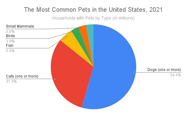
Pie chart of the most common pets in US households, 2021. Data taken from the US Census.
Data visualizations can simultaneously represent multiple different categories of data as well. For example, the bar chart below shows the same data as the pie chart above. Viewers are able to quickly interpret the chart and see various points of information. From the bar graph, people can draw several conclusions:
- Dogs are the most popular pet in the United States, with households owning 49 million.
- Dog ownership is almost twice that of cat ownership.
- Fish, bird, reptile, and small mammal ownership at 12.8 million altogether does not meet the popularity of cat ownership at 28.2 million.
- At 2.7 million each, birds and small mammals are equally popular.
- At 2.5 million, reptiles represent the smallest category of pets.
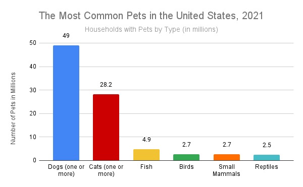
Bar graph of the most common pets in US households, 2021. Data taken from the US Census.
However, not all data visualizations are good data visualizations. Poorly designed visualizations can cause confusion or misinterpretation. Some data visualization may even be made to purposely mislead viewers. It is important to understand and follow best practices with data visualization to avoid creating misleading graphs or distorted messages. This chapter will discuss data visualization principles, types, and various tools and software available to create good data visualizations.
Types of Visualizations
There are many types of visualizations that can be used, including bar charts, histograms, heat maps, and pie charts. When choosing the right visualization, consider the purpose, audience, and context. For example, is the goal to demonstrate amounts (or comparisons), compositions (or proportions), distributions, or relationships? Also consider the type of data: numeric, categorical, mixed numeric and categorical, maps, network, time series, or text.
Infographics
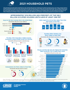
Infographics are usually a blend of different visualizations focused on one topic. Consider the following infographic:
Guides to Data Visualization Types
The Data Visualisation Catalogue – The Data Visualisation Catalogue, by Severino Ribecca, provides a comprehensive and interactive catalog for types of charts, tables, diagrams, and maps by name and by function. Each entry in the catalog includes a description of the type of visualization, benefits and downfalls to the type, and various tools that can be used to generate that type of visualizations.
The Periodic Table of Visualization Methods – The Periodic Table of Visualization Methods organizes a broad variety of visual representations by specific information problems. This interactive tool includes definitions and models of data, information, concept, strategy, metaphor, compound, process and structure visualization.
Steps to Creating a Visualization
“Steps to Creating a Visualization” section is adopted and slightly modified from the Data Visualization research guide created by UB Libraries’ 2018-2020 CLIR Postdoctoral Fellow, Rachel Starry. It is currently maintained by Carolyn Klotzbach-Russell. Guide content is licensed CC BY 4.0.
The following steps represent the general process you might take in order to create a visualization.
- Know your data. It is helpful to start with data that is clean (read more about what it means for data to be “clean” in the article “Tidy Data” by Hadley Wickham, 2014). If you are not the original creator of the dataset you want to visualize, you should also start by making sure you understand what the variables in the dataset mean and ensure that the data has secure provenance (i.e. you know where it came from and how it was created).
- Determine your purpose. Decide whether you are in the exploratory or explanatory stage of visualizing your data. Are you trying to find patterns, or are you trying to tell a story or support an argument with your visualization? Understanding your purpose can help you decide what data to include in your final visualization.
- Choose a chart type. Different charts are useful for different kinds of data, representing different numbers of variables, or showing different patterns and relationships among those variables. See the Types of Visualizations section.
- Decide on a visualization tool. There are many options available to help you create your visualization, from point-and-click online tools to desktop software or programming solutions using R, Python, or JavaScript. The Tools and Software section provides an introduction to some of the options based on the type of data you are visualizing, noting which platforms are free/open-source and which are available online.
- Refine your visualization. Once you have selected a tool and input your data, you can adjust some of the textual and visual aspects of your chart to make it more readable, by tweaking the chart axes, labels, or color palette. You should consider how your visualization will appear to people who have visual impairment or different kinds of colorblindness and try to make your visualization as understandable and accessible as possible, whether it will appear in print or on a screen.
Accessible Design–rework
“Accessible Design “ subsection adopted from Data Visualization was created by UB Libraries’ 2018-2020 CLIR Postdoctoral Fellow, Rachel Starry. It is currently maintained by Carolyn Klotzbach-Russell. Guide content is licensed CC BY 4.0.
When designing a data visualization, the primary goal is to communicate information using visual means, and whether you share your visualizations in print or digital form, designing for accessibility is important. Although color is most frequently mentioned in this context, accessible design goes beyond avoiding color palettes that make charts difficult to read by individuals with color vision deficiencies like red-green colorblindness, or protanopia. There are many ways to make your graphs easier to understand for people with visual impairments or other disabilities, and designing for accessibility can make your data visualizations more readable for all users.
The following articles offer good overviews of the issues involved in designing for accessibility.
- Cesal, Amy. June 26, 2018. “Accessible data viz is better data viz.“
- Grosser, Zach. January 10, 2018. “Accessible Colors for Data Visualization.“
- Tableau Desktop and Web Authoring Help. Version 2018.3. “Best Practices for Designing Accessible Views.“
Read more about the Web Accessibility Initiative at w3.org.
Color & Contrast
The following tools can help you get started with choosing accessible color palettes and contrast ratios in your visualization.
- ColorBrewer and Viz Palette are two tools for creating colorblind-safe color palettes.
- Contrast-Ratio and Color Safe can help you test whether your color palette and contrast ratios are WCAG 2.0-compliant.
- Colblindor can simulate color vision deficiencies on sample images or uploaded files.
General Accessibility Best Practices
In addition to color, there are other aspects of visualizations to consider when designing for accessibility. For additional guidelines, consult the CFPB Design Manual for Data Visualization.
- Image “alt” tags: Always add descriptive text in an “alt tag” when embedding your visualizations in a webpage. Screen readers read alt text out loud for users with visual impairment, so it is important to include a concise but accurate description of a graph.
- Font and descriptive labels: Use a sans-serif font for chart titles and descriptive labels, and consider labeling data directly whenever possible rather than putting values or other information only in a chart legend.
Tools and Software
- Excel – A robust, proprietary software that can be used to create visualizations from spreadsheet data.
- Google Sheets – Free with a Google account. A basic tool that can be used to create similar visualizations like bar charts and scatterplots.
- Tableau – A proprietary software program that works with numeric and categorical data to create data visualizations and advanced data dashboards.
- Rawgraphs – A free and open source tool for data visualization. The interface allows users to select graph type (i.e., scatterplot, bar chart, dendrogram, etc.) based on type of input data (i.e., numeric, categorical).
- Voyant – Is a free, web-based reading and analysis environment for digital texts.
- Coding – scripting languages can be used for from data analysis, data cleaning to data visualization for both numeric and text data. Both R and Python have libraries of packages to help make visualizations.
Tips and tricks
Be sure to clean and understand your data before you begin creating visualizations.
Clean your data
Be sure to clean and understand your data before you begin creating visualizations. Use tools such as Excel or OpenRefine, or do this programmatically using R or Python.
Consider the goal
Consider your goals before deciding on the type of visualization and variables to highlight. This will help you understand the types of visualizations that best suit your needs.
Make it easy to understand
Viewers should be able to easily understand what the visualization represents without needing to do “visual math” to interpret the information. There should be a balance with aesthetic elements and readability.
Use color carefully
Proper use of color can help viewers more efficiently understand data visualizations. Color choice is very important to consider. Try to use colors that could still be effective if converted into a grayscale (black-and-white) and consider accessibility concerns.
Make visualizations accessible
Follow best practices, including use of alt-text and appropriate color usage, to create visualizations that are accessible to the broadest possible audiences.
Adapted from Navigating the Research Lifecycle for the Modern Researcher by Brianna Buljung; Emily Bongiovanni; and Ye Li, CC Attribution NonCommercial 4.0