21 Scatterplot & Linear Regression
Topics Covered
In case you missed something in class, or just want to review a specific topic covered in this Module, here is a list of topics covered:
Recognizing Interpolation or Extrapolation[1]
While the data for most examples do not fall perfectly on the line, the equation is our best guess as to how the relationship will behave outside of the values for which we have data. We use a process known as interpolation when we predict a value inside the domain and range of the data. The process of extrapolation is used when we predict a value outside the domain and range of the data.
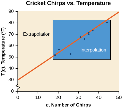
The graph below compares the two processes for the cricket-chirp data. We can see that interpolation would occur if we used our model to predict temperature when the values for chirps are between 18.5 and 44. Extrapolation would occur if we used our model to predict temperature when the values for chirps are less than 18.5 or greater than 44.
There is a difference between making predictions inside the domain and the range of values for which we have data and outside that domain and range. Predicting a value outside of the domain and range has its limitations. When our model no longer applies after a certain point, it is sometimes called model breakdown. For example, predicting a cost function for a period of two years may involve examining the data where the input is the time in years and the output is the cost. But if we try to extrapolate a cost when x = 50, that is in 50 years, the model would not apply because we could not account for factors fifty years in the future.
Different methods of making predictions are used to analyze data.
- The method of interpolation involves predicting a value inside the domain and/or range of the data.
- The method of extrapolation involves predicting a value outside the domain and/or range of the data.
- Model breakdown occurs at the point when the model no longer applies.
Try it! – Understanding Interpolation and Extrapolation
Use the cricket data from above to answer the following questions:
- Would predicting the temperature when crickets are chirping 30 times in 15 seconds be interpolation or extrapolation? Make the prediction, and discuss whether it is reasonable.
- Would predicting the number of chirps crickets will make at
 be interpolation or extrapolation? Make the prediction, and discuss whether it is reasonable.
Solution
- The number of chirps in the data provided varied from 18.5 to 44. A prediction at 30 chirps per 15 seconds is inside the domain of our data, so would be interpolation. Using our model:

Based on the data we have, this value seems reasonable. - The temperature values varied from 52 to 80.5. Predicting the number of chirps at
 is extrapolation because 40 is outside the range of our data. Using our model:

We can compare the regions of interpolation and extrapolation shown in the graph below.
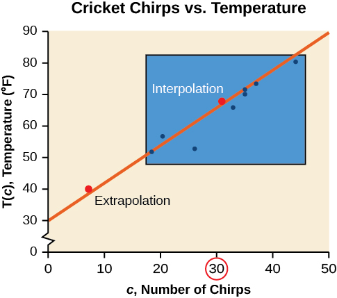
Our model predicts the crickets would chirp 8.33 times in 15 seconds. While this might be possible, we have no reason to believe our model is valid outside the domain and range. In fact, generally, crickets stop chirping altogether below around  .
.
Univariate Vs. Bivariate Data[2]
Much of what has been discussed so far has involved information from one data set. We typically call this Univariate Date.
Univariate Data
Univariate means “one variable”.
- Involves a single variable
- Does not deal with causes or relationships.
- Allows for the description of data collected.
- Is quantitative in nature
- Uses measures of central tendencies such as the mean, median, mode, quartiles, and the standard deviation
- Results can be shown in Bar graphs, Histograms, Pie charts, Line graphs, and Box plots.
One of the most powerful tools statistics gives us is the ability to explore relationships between two datasets containing quantitative values, and then use that relationship to make predictions. We will call this Bivariate Data.
Bivariate Data
Bivariate means “two variables”.
- Involves two variables.
- Deals with causes or relationships.
- Allows for an explanation of data
- Uses the analysis of two variables separately but simultaneously
- Uses a correlation between two variables
- Develops comparisons, relationships, causes, and explanations.
- Results can be shown in tables where one variable is dependent on the values of another variable
For example, a student who wants to know how well they can expect to score on an upcoming final exam may consider reviewing the data on midterm and final exam scores for students who have previously taken the class. It seems reasonable to expect that there is a relationship between those two datasets: If a student did well on the midterm, they were probably more likely to do well on the final than the average student. Similarly, if a student did poorly on the midterm, they probably also did poorly on the final exam.
Of course, that relationship isn’t set in stone; a student’s performance on a midterm exam doesn’t cement their performance on the final! A student might use a poor result on the midterm as motivation to study more for the final. A student with a really good grade on the midterm might be overconfident going into the final, and as a result doesn’t prepare adequately.
The statistical method of regression can find a formula that does the best job of predicting a score on the final exam based on the student’s score on the midterm, as well as give a measure of the confidence of that prediction! In this section, we’ll discover how to use regression to make these predictions. Before we take up the discussion of linear regression and correlation, we need to examine a way to display the relation between two variables x and y. The most common and easiest way is a scatter plot. The following example illustrates a scatter plot.
What is a Scatter Plot?
A scatter plot is a data graph that uses points to represent the relationship between two variables of interest. Although the horizontal axis is still associated with the independent variable and the vertical axis with the dependent variable, they do not have the same assumed relationship we normally think of with more common data graphs. Instead, by using a scatter plot, we are attempting to infer a relationship between the two variables.
The figure below is an example of a scatter plot modeling how time spent studying compares to exam scores.
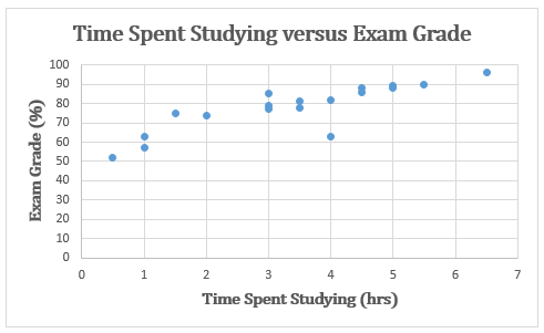
Many people would want to immediately say that more time spent studying causes higher exam scores. However, when we are using scatterplots in the coming sections, it is important that they should never be read as a definite relationship. Instead of a cause, we must emphasize a correlation instead.
Correlation is a description and measure of how well the change in two separate variables matches with each other. Correlation between two variables does not mean that one necessarily causes the other. Thus, in the math world, we emphasize that “Correlation does not equal causation.”
Drawing and Interpreting Scatter Plots[3]
A scatter plot is a graph of plotted points that may show a relationship between two sets of data. If the relationship is from a linear model or a model that is nearly linear, the professor can draw conclusions using their knowledge of linear functions. The figure below shows a sample scatter plot.
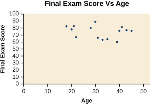
Notice this scatter plot does not indicate a linear relationship. The points do not appear to follow a trend. In other words, there does not appear to be a relationship between the age of the student and the score on the final exam.
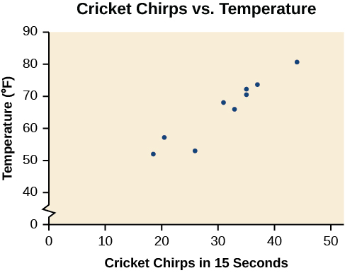
Try it! – Using a Scatter Plot to Investigate Cricket Chirps
Table below shows the number of cricket chirps in 15 seconds, for several different air temperatures, in degrees Fahrenheit. Plot this data and determine whether the data appears to be linearly related.
| number of cricket chirps | |||||||||
| Chirps | 44 | 35 | 20.4 | 33 | 31 | 35 | 18.5 | 37 | 26 |
| Temperature | 80.5 | 70.5 | 57 | 66 | 68 | 72 | 52 | 73.5 | 53 |
Solution
Plotting this data, as depicted in the figure below suggests that there may be a trend. We can see from the trend in the data that the number of chirps increases as the temperature increases. The trend appears to be roughly linear, though certainly not perfectly so.
A scatter plot shows the direction of a relationship between the variables. A clear direction happens when there is either:
- High values of one variable occur with high values of the other variable or low values of one variable occur with low values of the other variable.
- High values of one variable occur with low values of the other variable.
You can determine the strength of the relationship by looking at the scatter plot and seeing how close the points are to a line, a power function, an exponential function,
or to some other type of function. For a linear relationship, there is an exception. Consider a scatter plot where all the points fall on a horizontal line providing a “perfect fit.” The horizontal line would in fact show no relationship.
When you look at a scatterplot, you want to notice the overall pattern and any deviations from the pattern. The following scatterplot examples illustrate these concepts.
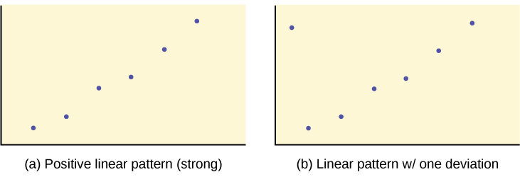
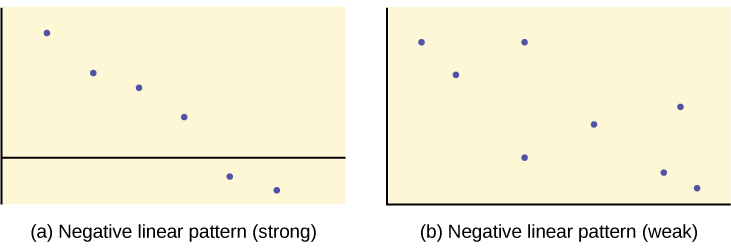
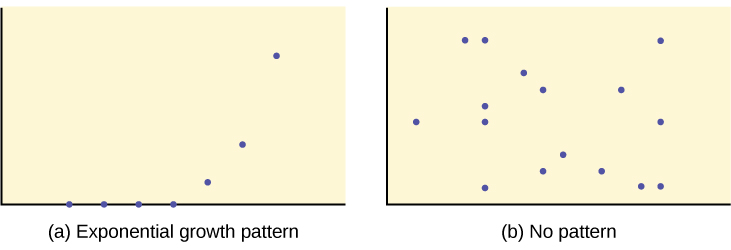
We are interested in scatter plots that show a linear pattern. The linear relationship is strong if the points are close to a straight line, except in the case of a horizontal line where there is no relationship. If we think that the points show a linear relationship, we would like to draw a line on the scatter plot. This line can be calculated through a process called linear regression. However, we only calculate a regression line (also called line of best fit or least-squares line) if one of the variables helps to explain or predict the other variable. If x is the independent variable and y the dependent variable, then we can use a regression line to predict y for a given value of x.
When a scatter plot is constructed, the behavior of the data can be said to have a correlation.
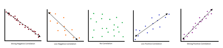
Correlation
Correlation is a way to define the relationship between the variables being compared.
Finding the Line of Best Fit[4]
Once we recognize a need for a linear function to model that data, the natural follow-up question is “What is that linear function?” One way to approximate our linear function is to sketch the line that seems to best fit the data. Then we can extend the line until we can verify the y-intercept. We can approximate the slope of the line by extending it until we can estimate the  .
.
Try it! – Finding a Line of Best Fit
Find a linear function that fits the data in the table below by “eyeballing” a line that seems to fit.
| number of cricket chirps | |||||||||
| Chirps | 44 | 35 | 20.4 | 33 | 31 | 35 | 18.5 | 37 | 26 |
| Temperature | 80.5 | 70.5 | 57 | 66 | 68 | 72 | 52 | 73.5 | 53 |
Solution
On a graph, we could try sketching a line.
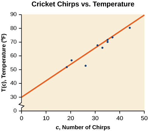
Using the starting and ending points of our hand-drawn line, points (0, 30) and (50, 90), this graph has a slope of

and a y-intercept at 30. This gives an equation of

where c is the number of chirps in 15 seconds, and T(c) is the temperature in degrees Fahrenheit. The resulting equation is represented in the graph above.
Analysis
This linear equation can then be used to approximate answers to various questions we might ask about the trend.
Interpreting the Line of Best Fit[5]
Let’s backtrack a little first and explore where the regression line comes from and what it means to say that a particular line does the “best job” of approximating the data. The way that statisticians characterize this “best line” is rather technical, but we’ll include it for the sake of satisfying your curiosity (and backing up the claim of “best”). Imagine drawing a line that looks like it does a pretty good job of approximating the data. Most of the points in the scatter plot will probably not fall exactly on the line; the distance above or below the line a given point falls is called that point’s residual. We could compute the residuals for every point in the scatter plot. If you take all those residuals and square them, then add the results together, you get a statistic called the sum of squared errors for the line (the name tells you what it is: “sum” because we’re adding, “squared” because we’re squaring, and “errors” is another word for “residuals”). The line that we choose to be the “best” is the one that has the smallest possible sum of squared errors. The implied minimization (“smallest”) is where the “least” in “least squares” comes from; the “squares” comes from the fact that we’re minimizing the sum of squared errors. Here ends the super technical part.
When a line of best fit is applied to a scatterplot, there are a couple of mathematical values that give quite a bit of information about the data relationship and what it means.
As discussed in prior chapters, you often see equations presented in the slope-intercept form,  . The slope of the line, m, describes how changes in the variables are related. It is important to interpret the slope of the line in the context of the situation represented by the data. You should be able to write a sentence interpreting the slope.
Slope:
The slope of the best-fit line tells us how the dependent variable (y) changes for every one unit increase in the independent (x) variable, on average.
For example:
THIRD EXAM vs FINAL EXAM EXAMPLE: The graph of the line of best fit for the third-exam/final-exam example is as follows:
The regression line (best-fit line) for the third-exam/final-exam example has the equation: 
Slope: The slope of the line is m = 4.83.
Interpretation: For a one-point increase in the score on the third exam, the final exam score increases by 4.83 points, on average.
Coefficient of Determination
When a trend line is first calculated by Excel for a scatter plot, it can apply an equation to the graph. The equation defines the line created for the data behavior and is accompanied by another value of 
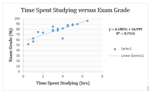
The Coefficient of Determination is a value , between 0 and 1, that gives a numerical description of how well the regression model fits or predicts the data it was derived from.
- When R2 is close to 0: the regression model does not fit the data at all.
- When R2 is close to 1: the regression model fits the data exactly.
- Is the square of the correlation coefficient.
- Often given as a %. When expressed as a percent, represents the percent of variation in the dependent (predicted) variable y that can be explained by variation in the independent (explanatory) variable x using the regression (best-fit) line.
- Is always a positive value.
Using the example above, has a value of .7316. Approximately 73% of the variation (0.7316 is approximately 0.73) in the exam grades can be explained by the variation in the time spent studying, using the best-fit regression line.
Correlation Coefficient
Besides looking at the scatter plot and seeing that a line seems reasonable, how can you tell if the line is a good predictor? Use the correlation coefficient as another indicator (besides the scatterplot) of the strength of the relationship between x and y.
The correlation coefficient isn’t given to you automatically when you are analyzing linear data with Excel. You must calculate it from the data you are given. Taking the square root of the coefficient of determination will give you the magnitude of the correlation coefficient. However, you must pay attention to the trend of the data to determine whether it is a negative or positive value. The slope of the line gives you a hint.

The correlation coefficient is a value, r, between –1 and 1.
- r > 0 suggests a positive (increasing) relationship
- r < 0 suggests a negative (decreasing) relationship
- The closer the value is to 0, the more scattered the data.
- The closer the value is to 1 or –1, the less scattered the data is.
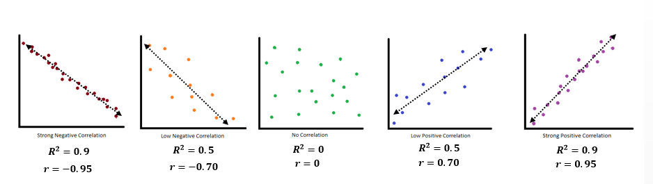
What the SIGN of r tells us
- A positive value of r means that when x increases, y tends to increase and when x decreases, y tends to decrease (positive correlation).
- A negative value of r means that when x increases, y tends to decrease and when x decreases, y tends to increase (negative correlation).
- The sign of r is the same as the sign of the slope, b, of the best-fit line.
Distinguishing Between Linear and Non-Linear Models[6]
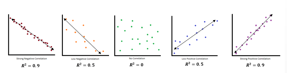
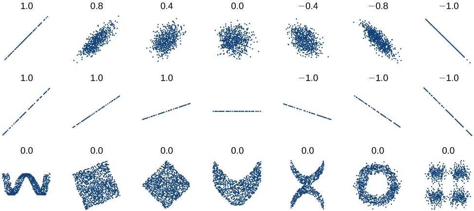
As we saw above with the cricket-chirp model, some data exhibit strong linear trends, but other data, like the final exam scores plotted by age, are clearly nonlinear. Most calculators and computer software can also provide us with the correlation coefficient, which is a measure of how closely the line fits the data. Many graphing calculators require the user to turn a ”diagnostic on” selection to find the correlation coefficient, which mathematicians label as r. The correlation coefficient provides an easy way to get an idea of how close to a line the data falls.
We should compute the correlation coefficient only for data that follows a linear pattern or to determine the degree to which a data set is linear. If the data exhibits a nonlinear pattern, the correlation coefficient for linear regression is meaningless. To get a sense of the relationship between the value of r and the graph of the data, Figure below shows some large data sets with their correlation coefficients. Remember, for all plots, the horizontal axis shows the input, and the vertical axis shows the output.
Predicting with a Regression Line [7]
Once we determine that a set of data is linear using the correlation coefficient, we can use the regression line to make predictions. As we learned above, a regression line is a line that is closest to the data in the scatter plot, which means that only one such line is the best fit for the data.
Try it! – Using a Regression Line to Make Predictions
Gasoline consumption in the United States has been steadily increasing. Consumption data from 1994 to 2004 is shown in the table below. Determine whether the trend is linear, and if so, find a model for the data. Use the model to predict consumption in 2008.
| U.S Gasoline consumption | |||||||||||
| Year | ’94 | ’95 | ’96 | ’97 | ’98 | ’99 | ’00 | ’01 | ’02 | ’03 | ’04 |
| Consumption (billions of gallons) | 113 | 116 | 118 | 119 | 123 | 125 | 126 | 128 | 131 | 133 | 136 |
The scatter plot of the data, including the least squares regression line, is shown in the figure below.
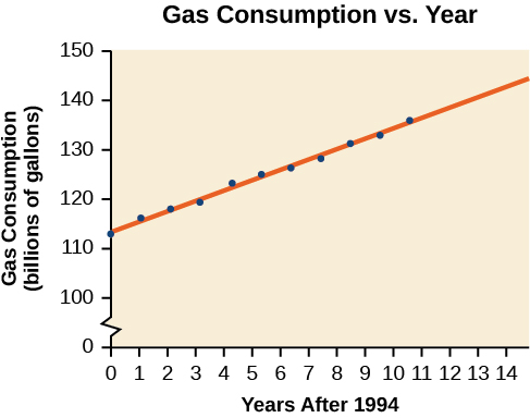
Solution
We can introduce a new input variable, t, representing years since 1994.
The least squares regression equation is:

Using technology, the correlation coefficient was calculated to be 0.9965, suggesting a very strong increasing linear trend. Using this to predict consumption in 2008 (t = 14),

The model predicts 144.244 billion gallons of gasoline consumption in 2008.
Key Concepts
- Interpolation and extrapolation:
- The method of interpolation involves predicting a value inside the domain and/or range of the data.
- The method of extrapolation involves predicting a value outside the domain and/or range of the data.
- A proportion is an equation of the form
 , where b ≠ 0, d ≠ 0.
 - Univariate data has one variable and bivariate data has two variables
- Scatterplots:
- Scatter plots show the relationship between two sets of data.
- Scatter plots may represent linear or non-linear models.
- The line of best fit may be estimated or calculated, using a calculator or statistical software.
- Interpolation can be used to predict values inside the domain and range of the data, whereas extrapolation can be used to predict values outside the domain and range of the data.
- The correlation coefficient, r, indicates the degree of linear relationship between data.
- A regression line best fits the data.
- Section material derived from Openstax Precalculus: Fitting Linear Models to Data-Fitting Linear Models to Data; Access for free at https://openstax.org/books/precalculus-2e/pages/1-introduction-to-functions ↵
- This material was created by Amanda Towry and updated from Openstax Contemporary math: Statistics - Scatterplots, correlations; Access for free at https://openstax.org/books/contemporary-mathematics/pages/1-introduction ↵
- Section material derived from Openstax Precalculus: Linear Functions-Fitting Linear Models to Data and Statistics 2e: Linear Correlation- Scatterplots; Access for free at https://openstax.org/books/introductory-statistics-2e/pages/1-introduction ↵
- Section material derived from Openstax Precalculus: Linear Functions-Fitting Linear Models to Data ↵
- Section material created by Amanda Towry and updated with Statistics 2e: Linear Correlation- Regression line and Contemporary Math: Statistics - Scatterplots, correlations ↵
- Section material derived from Openstx Precalculus: Linear Functions-Fitting Linear Models to Data ↵
- Section material derived from Openstax Precalculus: Linear Functions-Fitting Linear Models to Data ↵
predicting a value inside the domain and range of the data
predicting a value outside the domain and range of the data
a value, r, between –1 and 1 that indicates the degree of linear correlation of variables, or how closely a regression line fits a data set.
a statistical technique for fitting a line to data in a way that minimizes the differences between the line and data values
